A website refresh focussed
on health and wellness
When Dr. Rosie reached out to our team, she wanted to be able to reach more women in need of her health services.
She understood how frustrating some medical conditions are for women and wanted to build an online presence so her services could be more easily found by those in need.
The website needed to be approachable, SEO friendly, and offer more than her previous website while bringing down the overall maintenance costs. The “ClickFunnels™” service she was using was costly and unsatisfying to her business needs.
Luckily, a new Canadian grant paired with our creative juices means she can now get away from ClickFunnels™ and onto her goal of helping more women.
A modern website refresh focussed on health and leads

During our discussions with Rosie, it was clear she had a few key points in mind that she wanted to express on her new website. Along with increasing leads, bookings, and traffic, she wanted to shift the focus of her website to help more women with their health concerns.
-
ClickFunnels™ was working but Dr. Rosie was hoping that a solution was possible without the monthly recurring cost.
-
She wanted her clients to find her more easily by increasing the SEO friendliness of her site.
-
Direct the focus of the website to digestive health concerns that Dr. Rosie is able to assist her clients with.
How’d it turn out?
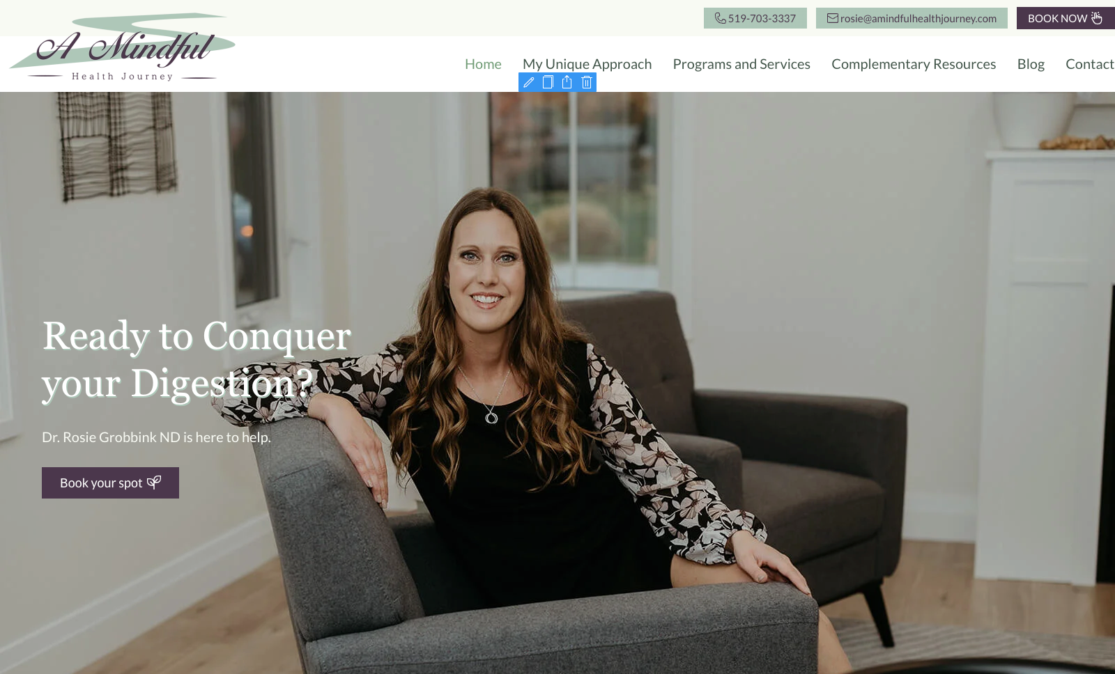
The resulting health and wellness website for A Mindful Health Journey turned out beautifully. The site covers a sensitive topic in an approachable, calm manner with Dr. Rosie there to help every step of the way.
Hint: hover over the plus signs below for more information.

Soft and Welcoming Look
Our graphic designer, Tom, revamped their logo that would blend with the welcoming and inviting tone of Rosie’s Naturopathic business. We worked with her colour choices of mauve and turquoise colour scheme with white space that would be used throughout the website.
SEO-Driven Content Focussed on Traffic
Our copywriter, Crystal, worked with Rosie diligently to double-check for keywords opportunities; they worked together to get the content maximized for generating web traffic and potential leads.
Fresh Imagery and Perfect Photo Selection
Rosie’s photographer took some fresh photos for the new website which helped our team come up with the right tone for the website. With a focus on nutrition and IBS, our website designer, Jamie, selected the correct imagery for the colour scheme and message of the website. He nailed it with his selections.
Custom SVG Icons and Icons on Buttons for Enhanced Interactivity
Soft Animated Headlines and Parallax Effects
Our web designer, Jamie, enhanced the user experience further by adding animated headlines throughout the site and parallax animations for more interactivity and fun.

A Click Funnel Experience without the Platform
Rosie was originally using Click Funnels for her marketing process and wanted to cut costs so we went to work. Jamie and Mark helped Rosie set up a Click Funnels system through our premium tools, which would have the same functionality as the Click Funnels platform.
Removal of the Header and Footer to Enhance Leads
Successful Cancellation of the Click Funnels Platform

About those key points….
The result is a free-flowing website that tastefully tackles a sensitive topic and looks fantastic.
We created a pseudo-ClickFunnels™ template to replace her costly ClickFunnel™ subscription. It costs less and works better because we are able to fully customize the look and feel of the landing page. The functionality seamlessly blended in with her business operations and we have heard nothing but good things from our client.
As the website shifted to focus on digestion, we noticed that IBS-related keywords were sky-high in search queries. We inserted these keywords (along with related ones) throughout the website with proper headlines, meta information, and carefully placed CTA buttons to help direct the visitor. Our analytics data is already seeing a boost in traffic. Right on!
Frequently Asked Questions
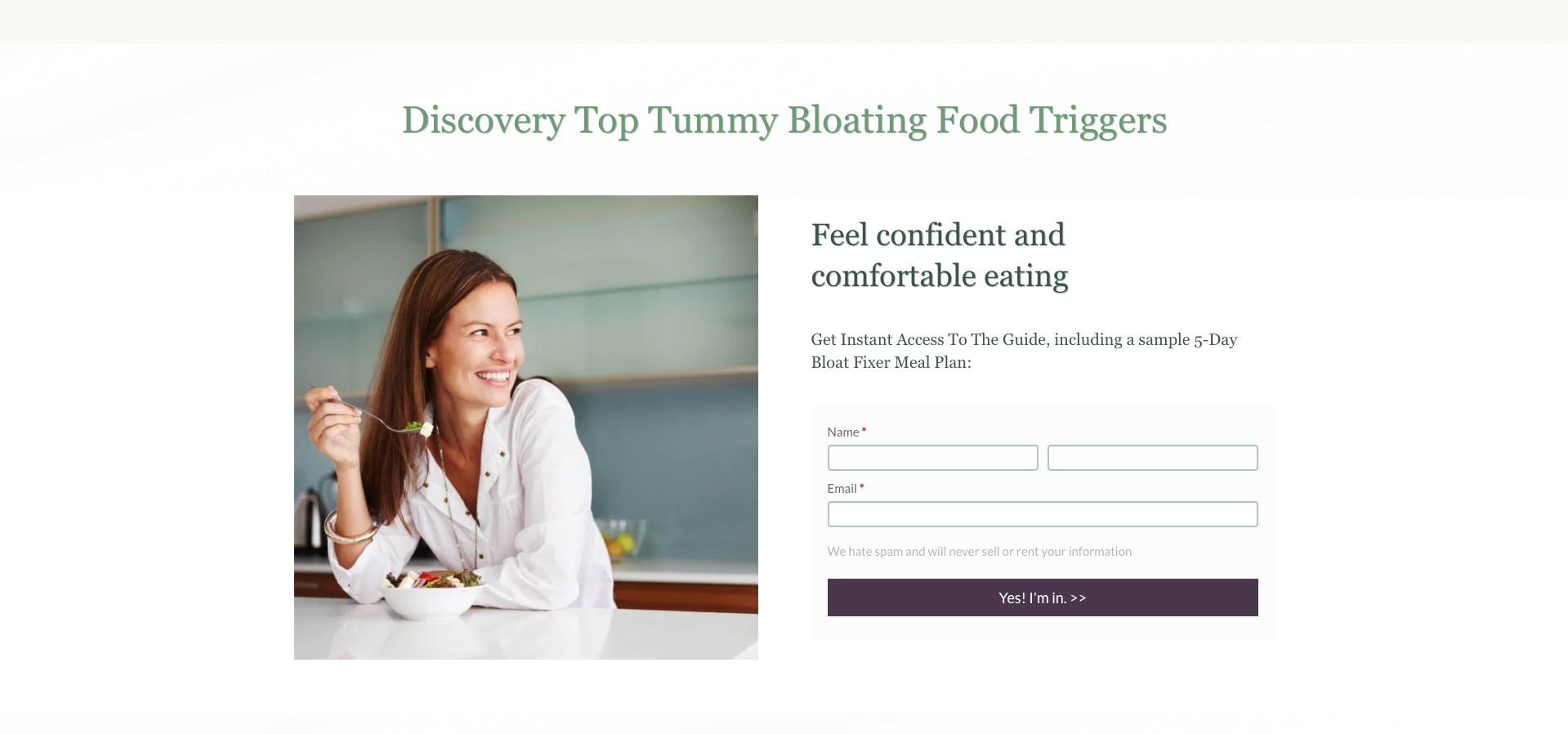
We made Dr. Rosie a custom landing page that mimics many of the key features that the ClickFunnels™ option provides.
The first step was to remove the header and footer sections from the landing page to ensure that users are not navigating away from this page after landing there. A typical ‘landing page’ will have no navigation and only one course of action for the user to take. Or they can close the, of course.
Then we added our premium for building tool which allows us to customize the fields to be similar to the old CF ones and still have the same actions take place. An API key was created on her existing ActiveCampaign account and when a user submits their information, they are automatically added to her list and the automation begins.
Pretty cool stuff.
Well, this one is hard to answer in short form. I mean, we all want to save money and with the advertisements from companies like Squarespace, GoDaddy, and others, its sure seems like websites can do DIY. Well, they can but they may not get found. Which is what you want, right?
Look, much like your business SEO is complicated. So focus on what you are good at and let us help with the SEO and web design.
Yes, yes, yes! Although we are in the business of building websites, we would be confident in saying that in the not-to-distant-future a well done GBP/GMB Listing may be more valuable than a well done website. More on this to come.
Let’s discuss your next website project
We offer a free 30-minute call so we can get some clarity on your needs. There is zero obligation. Let’s chat soon.