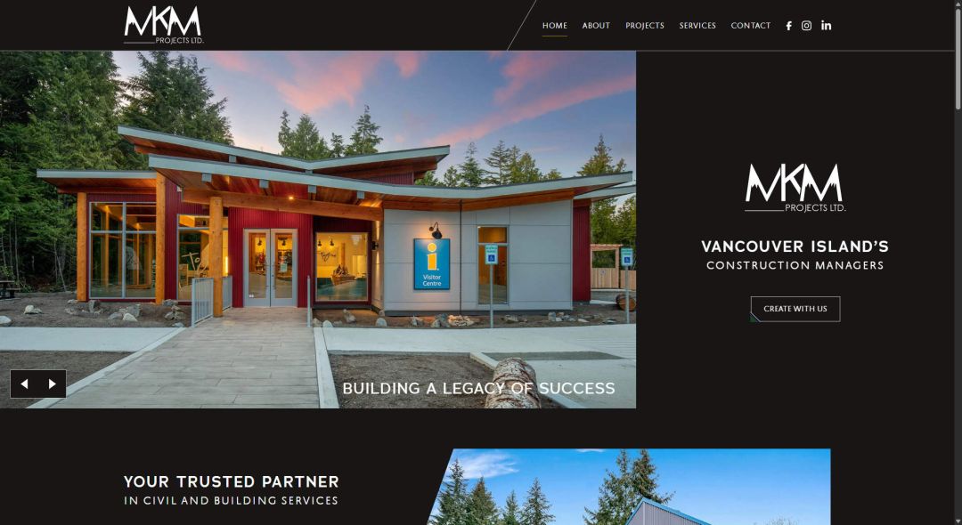
MKM Projects


Showcasing a construction portfolio built to impress

MKM Projects came to us with a strong body of work, commercial, municipal, institutional, and residential builds across Vancouver Island, but a website that didn’t do that work justice. They needed a site that could present a wide range of completed projects clearly, without overwhelming visitors browsing on any single category.

Our goal was to build a site that let MKM’s portfolio speak for itself: bold imagery, clear categorization, and a straightforward path for potential clients to get in touch and start their own project.

A portfolio built around real project categories

MKM’s work spans a wide range of build types, so organization was key from the start.

  • Group every project cleanly into Commercial, Municipal, Institutional, and Residential categories
  • Let visitors filter and browse completed work without digging through a long, undifferentiated list
  • Carry forward a strong archive of past projects — from the Cumberland Fire Hall to the Into the Woods Early Learning Child Care Studio — so MKM’s experience is immediately visible
  • Make the path to starting a new project simple and direct

How did we do?

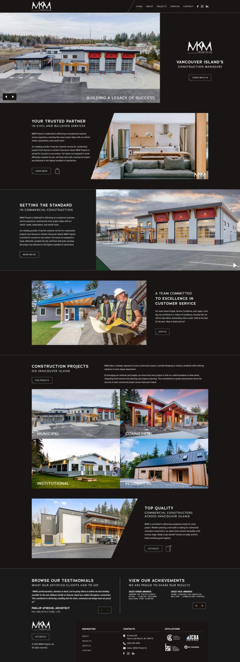
A filterable project grid We built a clean, image-forward grid for the Projects section, letting visitors browse by category — Commercial, Municipal, Institutional, and Residential — with each project card linking straight to more detail.

A confident, bold “Let’s Build” call to action We designed a distinct, high-contrast CTA button carried across the site, giving visitors a clear, consistent next step no matter where they land.

A platform upgrade mid-project MKM’s site started as a clone of their existing Divi build, but partway through we made the call to rebuild it properly on YOOtheme instead — giving the final site more flexibility and a stronger foundation going forward, rather than settling for a like-for-like recreation of the old platform.

A dark, industrial visual style to match the work The overlay graphics and imagery-first layout were designed to reflect the scale and precision of MKM’s construction work, rather than defaulting to a generic corporate template.

Other small details…

Since MKM didn’t have any forms on their previous site and already had branded email in place, we were able to focus our efforts entirely on the portfolio experience and visual presentation rather than rebuilding infrastructure that was already working well.

The final site was launched by cloning the completed dev build directly to the live domain, keeping downtime to a minimum during the switch.

Hi! My name is Mark Beuerman and we look forward to helping you unlock the full potential of your company.